
Are you building web projects for the developing world? If so, you can probably forego any in-depth testing on flagship phones like the iPhone 6S.
Are you building web projects for the developing world? If so, you can probably forego any in-depth testing on flagship phones like the iPhone 6S.
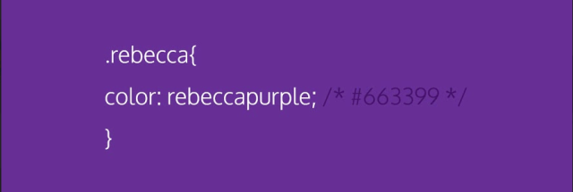
Did you ever wonder how we ended up with color names like “thistle” and “peru” in the CSS color spec? This article provides a little history.
This is an excellent big picture perspective on Google’s Accelerated Mobile Pages (AMP) from Tim Kadlec.
The latest draft of the Shadow DOM spec has been published. Check it out and give the team some feedback.
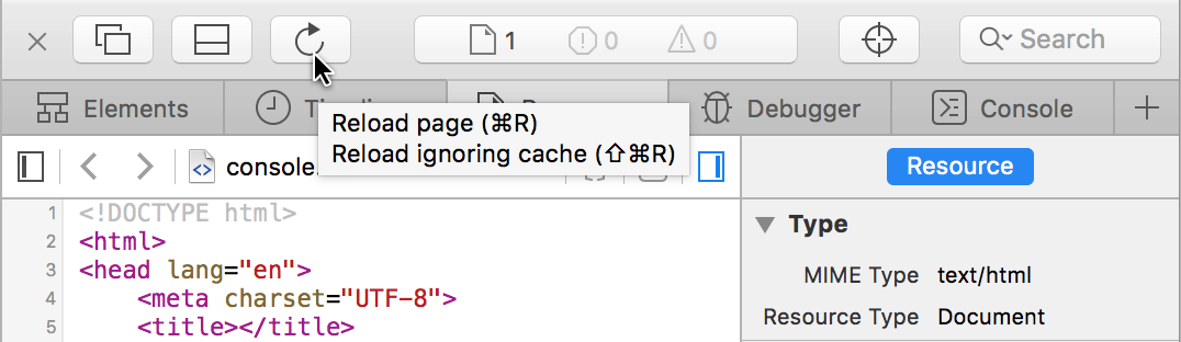
A good overview of how you can get more efficient in Safari’s Web Inspector panel.

Gemma Church on why the words you choose matter. I wholeheartedly agree. Your website is a conversation with your customers, which means words are central to it.
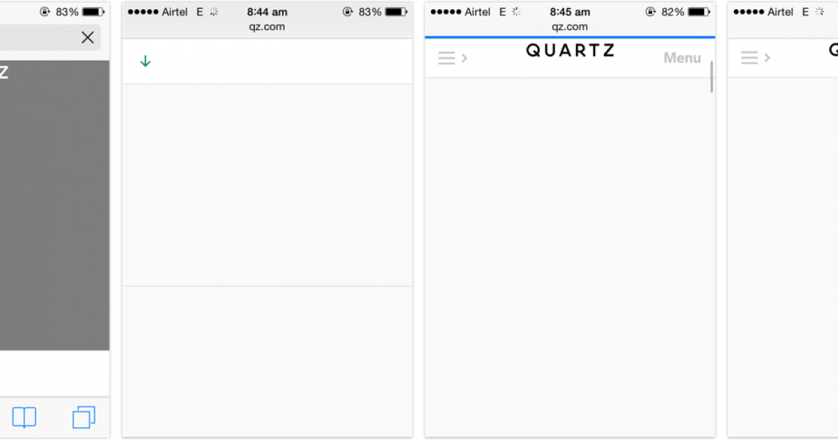
Just like JavaScript, CSS, and images, you are not guaranteed that your web fonts are going to reach (or be appreciated by) your users. I know I constantly run into web font-related performance issues with Wired on my iPhone, even on a speedy WiFi connection, so I’m not at all surprised users are looking to block them.
How do you deal with this? Don’t hide your content until the fonts arrive. Assume they never will.
A good overview of layout and reflow triggers in JavaScript. It’s worth noting that this resource can be made more complete with contributions from the WebKit and Microsoft Edge teams (hopefully forthcoming).
A relatively brief overview of the privacy policies and practices of four companies you probably interact with on a regular basis. It’s good food for thought.
I’ve written about why you should not autoplay videos, but here’s another account of why it’s bad and what you can do about it.