Learn from the Past, Enhance for the Future
I had the great pleasure of delivering the closing keynote for the first EnhanceConf. I wanted to talk about voice and the future of “headless” user interfaces. Here’s what I had to say.
Early last year, a cry for help on Stack Overflow drew my attention:
I’ve been trying to make my site … work fully without JavaScript, however, I’ve found myself in situations where I can’t honestly think how I would do some features without it.
The submitter, JamHam, is certainly not alone in feeling this way. The ways we build websites change all the time. When I started out, it was pretty simple: you had HTML. Lots and lots of HTML. We also had Java applets, then Shockwave and Flash. Then we got some very basic stylesheet support. Then JavaScript.
As the years pressed on, the three major technologies underpinning the Web—HTML, CSS, and JavaScript—evolved and became even more powerful.
Things coalesced for a while in the early oughts before Jesse James Garrett re-christened a relatively obscure Microsoft creation, XMLHttpRequest, “AJAX” and set countless designers hearts aflutter with the promise of banishing the page refresh. At the heart of this revolution was JavaScript, and companies began betting their entire Web presence on its availability. Most learned that wasn’t such a good idea and began using it as an enhancement to the experience rather than a requirement.
After Ajax, there was HTML5, CSS3, and a host of new JavaScript APIs… the JavaScript frameworks—Angular, Knockout, Backbone, Ember, React… The ways we can create Web products just keep changing; sometimes slowly, but more often than not at such a speedy clip it leaves my head spinning.
The one thing I’ve learned however, being an “old man” in Web terms, is that web design is cyclical, just like everything else. The challenges we face building web products today are not new challenges. Moreover, the lessons we learned building similar products in the “Web 1.0” days pay dividends today and will continue to do so in the future.
When I started out on the Web, I had a 28.8 kbit/s modem, but still had to support users on 14.4 kbit/s connections. That’s half the speed I was used to running at. That may have been 20 years ago, but the lessons I learned about streamlining my HTML, optimizing images, and minimizing downloads has helped me immeasurably when dealing with high-latency mobile networks and excruciatingly slow “broadband” connections.
(I’m looking at you, every hotel ever.)
When I started out on the Web, I had an 800x600 monitor, but still had to support 640x480 screen resolutions. I learned the importance of prioritizing content long before media queries and flexbox enabled us to adapt our layouts on the fly. And while our computer screens keep getting bigger, mobile devices and wearables present the very same challenges I was tackling with 640x480, but in even tighter confines.

When I started out on the Web, there was no JavaScript. All calculations, data processing, and dynamic functionality had to be handled by the server. I learned how to process web forms in Perl, later trading in my CGI scripts for PHP, Ruby, and Python. And while the vast majority of our users today have JavaScript baked into their browsers, I still rely on server-side fallbacks because I recognize that we don’t control the execution environment on the open Web.
The Web is the most hostile software engineering environment imaginable.
— Douglas Crockford
You’re a savvy bunch, so I’m sure none of this is news to you, but I wanted to set the stage for what I’m really here to talk about. There’s a new cycle about to hit us and chances are you might not be thinking about it yet: Voice.
I: The Headless UI
Science fiction has often been a strong predictor of our technological future. HAL 9000 from 2001: A Space Odyssey is probably the most (in)famous example of a computer that interacts with its users largely via voice. As a concept, the “talking computer” has appeared time and time again in space-age fiction—everything from Red Dwarf to Interstellar.
To function in the real world like they do on TV and in the movies, computers need two capabilities: Natural language processing (to understand what we say) and speech synthesis (to communicate, aurally, back to us).

Natural language processing has its roots in the 1950s, but many of these early speech models were limited because they were built around a series of hard-coded rules that the computers followed. In the 1980s, however, machine learning and real-time statistical analysis became possible.
As hardware capabilities continued to improve and computers became more powerful, they got better at recognizing the words we were saying to them. Eventually, and with enough processing power, they also began to assign meaning to words and could react accordingly.
As the years marched on, the overhead required to enable our projects to listen to our users has dropped significantly.
Listening is great, but true communication is bidirectional. Humans have been experimenting with speech synthesis since the late 1700s, but it wasn’t until the 1980s that we got a decent result though. By the 1990s, reasonably intelligible text-to-speech software was being rolled out alongside most operating systems as a core component of their assistive technology offerings: The “screen reader”. At present, screen readers are probably the best indicator of what the future of voice interaction will sound like.
When combined, the ability of a computer to listen and respond gave rise to virtual personal assistants like Siri, Cortana, Alexa, and more.
Over time, our customers will become more accustomed to and reliant on voice-based interactions with their computers and the Web. Enabling them to complete critical tasks without a visual user interface will be crucial for the long-term success of our Web-based products.
So how do you design a “headless” UI? That’s easy: You design the conversation.
II: Interface is Conversation
Let’s take a trip back in time to one of the earliest computer games: Zork. Zork was written between 1977 and 1979. It’s a text-based adventure game that operates a lot like a game of Dungeons & Dragons—with the program serving the role of gamemaster.
West of House
You are standing in an open field west of a white house, with a boarded front door.
There is a small mailbox here.
> open mailbox
As you move from location to location throughout the game, the program describes the environment and notes objects and people you can interact with. You type what you want to do and the program tells you the results of your actions.
As this was the early days of computer gaming, you might think Zork’s interactions would be simple noun-verb combinations—“kill troll”—but Zork was more sophisticated than that. Its parser was could understand far more complex commands like “hit the troll with the Elvish sword”. This made the experience far more natural, as if you were playing a table top game with friends.
Whether Zork or a webpage, every interface is a conversation—we engage our users directly in an effort to inform them, entertain them, or persuade them to act in a particular way. How this conversation goes directly affects the experience our users have.
Let’s look at a few web page and interface component types to identify the kinds of conversations we trying to have with our users in each:
- Homepage
We’ve just met and I’m explaining what you can do on my site (and, in some cases, why it matters). - Contact Form
You’re asking or telling me something. I want to help you. It’s common courtesy for me to let you know how long it may take me to get back to you with a response; and for me to abide by that. - Product Page
I’m explaining what a particular object or service is, what it does, and how it will benefit you. I should “show” you why something is great rather than “tell”-ing you that it is because you’re immune to salesy BS. - Status Update
I may prompt you with a question, but I’m here to listen. The floor is yours. (But I’m probably mining what you say for data so I can market to you later.)
When we approach interfaces as conversations, we humanize our products and improve our users’ experiences. When we don’t, things can fall apart quickly…
Over the 2011 holidays, Facebook users were uploading photos like crazy. In the span of a few days, Facebook processed more photo uploads than are contained in the entirety of Flickr. Seriously, that’s a lot of photos.
One unintended consequence of this deluge of photo uploads was a significant uptick in people asking Facebook to remove specific ones. Facebook received millions of these “photo reports”, but they made no sense: Moms holding babies reported for harassment, pictures of puppies reported for hate speech, and so on. Roughly 97% of these photo reports were dramatically mis-categorized.
Facebook’s engineers reached out to some of the users who had reported these photos to get a bit more background regarding their submissions. At the time Facebook’s photo reporting interface provided a list of reasons users could choose from if they wanted a photo removed, but, as Facebook soon discovered, many of the reports were made because users didn’t want the photo posted for reasons other than those provided. In some cases, it was because they didn’t like how they looked in the photo. In others, it was because the photo was of an ex-partner or even a beloved pet they’d shared with an ex-boyfriend or ex-girlfriend.
The existing photo reporting tool had not done a good job of accounting for these more personal reasons for wanting a photo removed, so the Facebook engineers went to work. They added a step that asked How does this photo make you feel? The options were simple:
- Embarrassing
- Upsetting
- Saddening
- Bad Photo
- Other
The “other” option also provided a free-response text field to fill in.
With this system in place, they found that 50% of reporters who answered the new question chose one of the provided options. That was pretty helpful, but there was still a problem: 34% of the “other” respondents were writing “It’s embarrassing” in the blank rather than choosing the “embarrassing” option already provided.
What the Facebook team realized was that people were not identifying with the “embarrassing” text (or may have even thought it was referring to them, rather than assuming an implied “It’s”). A subtle shift in language was needed, so they changed the label to Please describe the photo and they updated the options to mirror how people actually talk:
- It’s embarrassing
- It’s a bad photo of me
- It makes me sad
With this subtle change, they were able to increase the percentage of photo reporters who chose one of the options provided to a whopping 78%.
Words matter. Even in something as simple and banal as a form, the words we choose set the tone for our users’ experiences and often have an affect on what they do… or fail to do.
The text of our interfaces—especially form labels and responses—is just one small part of the content picture, but it’s a perfect example of how easy it can be to overlook conversation in our interfaces. There are many other types of content like product descriptions, marketing copy, legal statements, visualizations, video, audio, and more. Content is where experience begins. It’s the core that we seek to progressively enhance. It’s also the foundation upon which the voice-based experiences of the future will be based.
The more time and consideration we put into how our interfaces read, the better-positioned we will be to succeed in the future of headless UIs. Once stripped of its beautifully-crafted, responsive layout, engaging animations, and artful illustrations, does your site hold up?
Back in 2006, Dustin Diaz proposed CSS Naked Day—a day when sites could be stripped of their visual design to showcase their content, semantics, and organization.
It will be a test case to see how usable your website is to others without a “design”.
—Dustin Diaz
“Design”, as Dustin was refering to it, is the visual design of a site, but design is not solely concerned with visual representations. Diving into etymology for a moment here, design comes from the Latin designare meaning “to mark out or indicate”. The purpose of design is not to make something pretty, it’s to clarify.
If the words we use form the basis of the conversations we have with our users, the semantics we employ clarify that meaning. Choosing elements with semantic value enriches our content, illuminating the meaning and intent of our words in order to overcome the limitations of text and bring it up to par with spoken language. After all, they may look the same visually, but there’s a big difference between these two statements:
<p>I <em>really</em> want to be your friend.</p>
<p>I <i class="sarcasm">really</i> want to be your friend.</p>
Beyond using markup to clarify the intent of the words we write, we can use it to spell out relationships that are often represented visually. Dustin described one way we do this as part of the impetus for CSS Naked Day (emphasis mine):
In the spirit of promoting Web Standards along with good semantic markup and proper hierarchy structures
By “proper hierarchy”, Dustin is talking about the document outline. A document outline is created through use of heading elements (h1–h6). It provides a easy way to review the organization of our web pages and validate our source order decisions. It also helps us ensure the flow works, which is incredibly important in any conversation. It helps us get to the point, streamline our content, and remove distractions… all of which are a sign of respect to our users.
None of this is news, of course, content strategists have been recommending that we streamline our content since the dawn of the Web. Sadly, many folks didn’t heed that advice until they were forced to confront the often infuriating world of mobile. Smaller screens required focused content.
When Luke Wroblewski coined “mobile first”, he told us to focus on the core purpose each and every page. He was, in essence, telling us to focus on the conversation we are having with our users. This approach pays huge dividends on small screens, but when it comes to voice-based interactions, “the page” doesn’t really exist. Experience is the sum of each individual interaction. As part of their Alexa Skills Kit, Amazon offers a ton of recommendations for designing for voice, many of which happen to be equally useful for sighted users.
Write for People
We don’t author content for ourselves. We write for others. If what we write frustrated or alienates our users, we’ve failed at our job. In their profoundly helpful book Nicely Said, Nicole Fenton and Kate Kiefer Lee offer numerous suggestions for how to write with the reader in mind:
- Be clear.
- Be concise.
- Be honest.
- Be considerate.
- Write how you speak.
They also make the recommendation that you read your work aloud. As we head into the world of voice-based interactions, that’s beta testing!
Avoid Technical and Legal Jargon
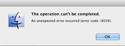
When we are writing for our readers, we need to be familiar with their level of domain knowledge so we don’t frustrate or alienate them. For example, if you track error codes for issues on your site, send them to your developers, but never present them to a user.
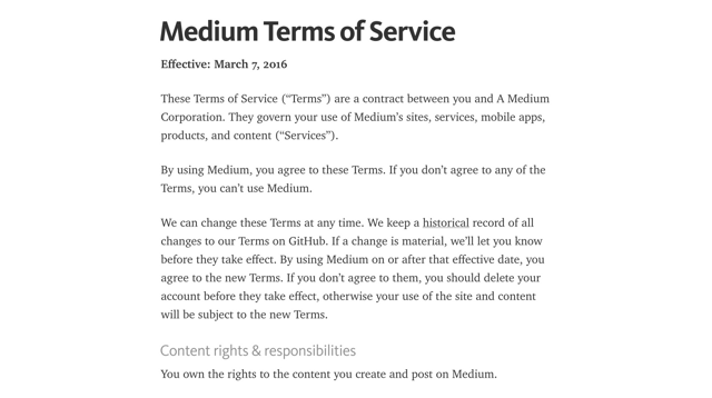
Similarly, we should avoid legalese and write in plain language. Medium has done a great job of this with their Terms of Service.
When Requesting Feedback, Make It Clear that the User Needs to Respond
In perhaps the most common form example, consider the label “First Name”. It’s not terribly conversational and doesn’t beg for a response. Labels like “What is your first name?” make it clear the user should respond.
<label for="first_name">What’s your first name?</label>
<input name="first_name" id="first_name" />Similarly, when there’s an error, notify them of the error and, if possible, give them some clues on how to fix it.
<label for="first_name">What’s your first name?</label>
<input name="first_name" id="first_name" aria-describedby="first_name-error" />
<em id="first_name-error">
  Without your first name, I won’t know how to address you. Could you please
  provide it?
</em>When Asking a User to Choose, Clearly Present the Options
This comes into play often when dealing with forms. Ensuring radio and checkbox controls are properly associated with their labels is critical.
<input type="radio" name="agree" id="agree_yes" value="yes" />
<label for="agree_yes">Yes</label>
You can also use the fieldset and legend elements to group the related controls, but be sure to make the legend focusable or associate it with the first focusable form control in order to ensure the question is read out.
<fieldset>
  <legend tabindex="0">
    Do you agree to the terms of service for this site?
  </legend>

  <input type="radio" name="agree" id="agree_yes" value="yes" />
  <label for="agree_yes">Yes</label>

  <input type="radio" name="agree" id="agree_no" value="no" />
  <label for="agree_no">No</label>
</fieldset>We should strive for the same sort of clarity when presenting navigation options. The HTML5 nav element enables us to semantically identify an area of the page being used for navigation. It does not, however, identify the nav element as being for navigation when encountered naturally in the flow of the document. For that reason, it can be useful to provide an textual introduction to the section, even if you choose to visibly hide it. You might even consider expanding the text of your navigation items to provide additional context.
<nav id="nav" tabindex="0" aria-labelledby="nav-title">
  <h1 id="nav-title" class="hidden">Here’s what you can find on this site:</h1>
  <ul>
    <li>
      <a href="/about/"
        ><b class="hidden">A Bit </b>About<b class="hidden"> Me</b></a
      >
    </li>
    <li>
      <a href="/notebook/"><b class="hidden">Entries in My </b>Notebook</a>
    </li>
    …
  </ul>
</nav>Prompts Should be Short, While Still Being Clear.
In a 1933 lecture at Oxford, Albert Einstein famously said
It can scarcely be denied that the supreme goal of all theory is to make the irreducible basic elements as simple and as few as possible without having to surrender the adequate representation of a single datum of experience.
Or, as Roger Sessions paraphrased it
Everything should be as simple as it can be but not simpler.
Clear and concise writing is the hallmark of great content. We need to resist the urge to write for writing’s sake. We write in the service our audience, not for ourselves.
Government websites are some of the worst offenders in this area. Consider this lovely passage:
Heavy rains throughout most of the State have given an optimistic outlook for lessened fire danger for the rest of the season. However, an abundance of lightning maintains a certain amount of hazard in isolated areas that have not received an excessive amount of rain.
It could be written far more clearly as
Heavy rains throughout most of the State have lessened fire danger for the rest of the season. However, lightning threatens isolated dry areas.
Here in the UK, the Government Digital Service has made great strides overhauling excruciatingly painful content and making it easier to read and understand. One such example is their overhaul of the Accelerated Possession process that allows landlords to evict a tenant.
The original paper form asked for the address like this
The claimant seeks an order that the defendant(s) give possession of:
(If the premises of which you seek possession are part of a building identify the part eg. Flat 3, Rooms 6 and 7)
Before requesting the type of property concerned
(‘the premises’) which is
☐ a dwelling house
☐ part of a dwellinghouse
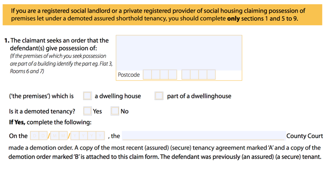
Clear and to the point, right?
The GDS went to work and streamlined the process in plain language:
What kind of property do you want to take back?
◎ A self-contained house, flat or bedsit
◎ Room or rooms in a property.
Tenants may share kitchen or bathroom
Then they allow you to lookup the property or manually enter the address.
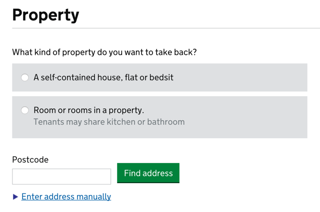
While not specifically designed for the future of headless UIs, this form is prepared for their eventuality.
Ask Only Necessary Questions
We show our users respect by respecting their time. Obviously straightforward, brief writing is one way we do that, but another is to reduce the time it takes to complete a task. Many forms are brimming with fields to be filled in. In some cases, the vast majority are purely optional. And while it may be easy to spot the required fields visually, bypassing them in an aural interface can be incredibly difficult.
User experience designers have been pushing for simplified forms since… well, as long as I can remember. Users appreciate them, they tend to result in better data, and they also tend to convert better than long forms. And when it comes to voice-based interactions, they will become a necessity. No one is going to want to spend 15 minutes working their way through a 15 question registration form when all that’s required is their email address and for them to choose a password.
On a similar note, we should avoid slicing fields into multiple parts if at all possible. For instance, you still see fields like this one, asking for a US phone number, quite often:

When interacting with this construct via voice, a user will be required to supply three separate values. In order to do so, each field would require a label. Even in the States, most developers would only know how to label the first of those three boxes. (They are area code, exchange or central office code, and line number, if you’re interested.)
HTML5 introduced a host of new field types that consolidate phone numbers, dates, times, and other complex data types into single fields. Use them! As an added bonus, most enforce content validation and formatting rules for you automatically.
Present Information in Consumable Pieces
Like computers, we humans have a finite amount of “working memory”. The amount of mental resources required to operate an interface is called its “cognitive load”. When the amount of information we need to process exceeds our capacity to handle it, we can miss important details, have trouble concentrating, and become frustrated.
We deal with cognitive load in GUI design all the time, but in voice-based interactions, there are no visuals to act as signposts and provide reminders about where we are and what we’re doing. This is why it is critical to break complicated tasks down into simpler ones and eliminate excess noise (like non-required fields). We can also reduce cognitive load by chunking search results and other list-type content into small groups, asking the user if they want more before loading and presenting them.
The top seller in the garden department is Repel Lemon Eucalyptus Natural Insect Repellent, 4-Ounce Pump Spray
Would you like to hear the rest?
III: Future Enhancements
Paying attention to how our interfaces read is critical to success in the future of voice-based interactions. Thankfully, we already view content as the centerpiece of every progressively enhanced experience. But we can go further.
Both Microsoft and Amazon have given us the tools to voice-enable our websites beyond the HTML we present. Amazon has chosen to do this via a dedicated JSON API, through which we can “teach” Alexa “skills”. Using this API, you can enable your users to access core site functionality through the Echo, FireTV, or any other device that has integrated the Alexa Voice Service.
Microsoft has taken a slightly different approach. Using a relatively simple XML format, they have enabled us to teach Cortana new commands that tie directly into our website.
<meta name="msapplication-cortanavcd" content="http://myapp.io/vcd.xml" />All we need to do is include a meta tag pointing to an XML file that details the commands (and variations) and, when a user installs the site as a hosted app, Cortana picks up the new commands automatically. Those commands, when issued, can open a specific page or even kick off JavaScript methods in the target page.
<?xml version="1.0" encoding="utf-8"?>
<VoiceCommands xmlns="http://schemas.microsoft.com/voicecommands/1.2">
  <CommandSet xml:lang="en-us" Name="groupPost">
    <CommandPrefix>Group Post</CommandPrefix>
    <Example>Group Post add note</Example>
    <Command Name="addNote">
      <Example>add a note {message} using group post</Example>
      <ListenFor RequireAppName="BeforeOrAfterPhrase">[please]
        add a note [that] {noteSubject}</ListenFor>
      <Feedback>adding {noteSubject} to Group Post</Feedback>
      <Navigate Target="/addNote.htm"/>
    </Command>
    <PhraseTopic Label="noteSubject" Scenario="Dictation"></PhraseTopic>
  </CommandSet>
</VoiceCommands>
We are just starting to scratch the surface of what’s possible in voice-enabling the Web, but it’s exciting to see how some companies are addressing this opportunity. It’s always interesting when things come full circle and we see how lessons we learned early on in the Web remain applicable, not matter how much or quickly things seem to change. Seeing this pattern repeat time and time again is why I’m so drawn to the philosophy of progressive enhancement; it’s not only concerned with supporting the past… it’s setting us up for success in the future.
Webmentions
-
In 'Learn from the Past, Enhance for the Future' @AaronGustafson wants us all to have more meaningful conversations aaron-gustafson.com/notebook/learn…
-
Learn From the Past, #Enhance for the Future, by Aaron Gustafson @AaronGustafson aaron-gustafson.com/notebook/learn… #UX
-
Apprendre du passé, améliorer le futur, par Aaron Gustafson @AaronGustafson aaron-gustafson.com/notebook/learn… #enhance #UX
-
“The challenges we face building web products today are not new challenges.” — @AaronGustafson aaron-gustafson.com/notebook/learn…
-
Interesting article from @AaronGustafson. Frontend to content to UX. They tackle the same problems and always have. aaron-gustafson.com/notebook/learn…
-
Interesting article from @AaronGustafson. Frontend to content to UX. They tackle the same problems and always have. aaron-gustafson.com/notebook/learn…
-
Great read: Learn From the Past, Enhance for the Future bit.ly/1XCuxzG by @AaronGustafson #webdev #webdesign
Comments
Note: These are comments exported from my old blog. Going forward, replies to my posts are only possible via webmentions.Nice talk, wasn't there but two of my colleagues were at the conference. I like the idea of voice and conversational language being a good example of the future of progressive enhancement. Who's to tell what the future brings, if you build it well sites will continue to work for users.