Interface Experience Maps
One of the greatest challenges of progressive enhancement lies not with the coding, but with the planning. It can be incredibly challenging to articulate how a single interface might adapt to a wide variety of situations. Interface Experience Maps (Ix Maps) can help.
Back in 2007, I was presented with this challenge while putting together a talk called Ruining the User Experience (which I co-presented for the first time at SXSW with Sarah B. Nelson). In the talk, Sarah and I discussed how to treat JavaScript as an enhancement and what happens when you don’t—in 2007, I know!
Anyway, in the talk I was struggling to convey the various decision points and interface adjustments that would happen as a result of those decisions. I don’t remember which of us came up with the idea—it was probably Sarah—but we opted to use a flowchart to visually describe what we were talking about on stage. Here was the first one we did:
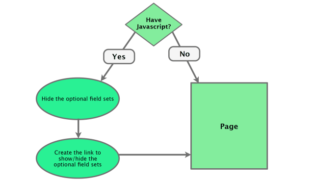
It was pretty rudimentary, but it got the point across.
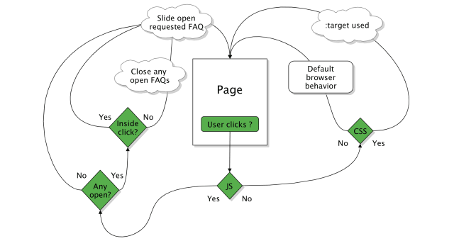
In future iterations of the talk, I expounded upon the idea of a flowchart for describing how an interface might adapt to different circumstances and browser capabilities. Here’s a particularly complex one I used to describe how a FAQ might function:
Over the years I found more and more ways to put these artifacts to use. And at a certain point, “flowchart” didn’t seem to cut it, so I began calling them “UI construction flows”—which, admittedly, was a mouthful—and then finally settled on the name “Interaction Experience Maps” with the help of a client.
The Benefits of Ix Maps
Ix Maps have become an invaluable tool to me and the teams I’ve worked with. They excel at articulating the different ways in which a given interface might adapt and what the end results of each adaptation might be.
This sort of documentation is invaluable to just about everyone on the team:
- Copywriters get a clear picture of the different experience possibilities so they can craft the copy accordingly;
- Designers can see the different experience possibilities and can create wireframes and visual designs that account for each;
- Developers get a clear outline of what functionality is expected and know exactly what features and capability detection to employ in generating each experience; and
- The quality assurance team has a clear picture of what they should be looking for in each component of an interface.
In short, Ix Maps ensure everyone on the team has a clear picture of what’s expected so they can work toward the common goal. One company I worked with found Ix Maps so useful that they created one for each and every pattern in their pattern library. Then they included the drawings as part of each pattern’s documentation.
Ix Maps Facilitate Collaboration and Iteration
An Ix Map is a pretty simple concept for anyone to come to grips with, making it a fantastic tool for enabling mixed teams—designers, developers, content folks, business strategists, etc.—to brainstorm ideas and build a strategy around progressive enhancement.
Time and time again, I have seen these simple diagrams bring a diverse team together and help them quickly and easily come up with very creative ways to address complex interface problems. That’s why I frequently use them as a tool in the workshops I lead.
Because they are so basic, Ix Maps can be sketched out quickly on paper, a whiteboard, or in software like OmniGraffle. And their simplicity also makes it quite easy to explore different ideas of how to adapt things and you don’t have to worry about throwing away an idea that doesn’t play out because it’s only a few boxes and arrows… you haven’t invested any time in design or production.
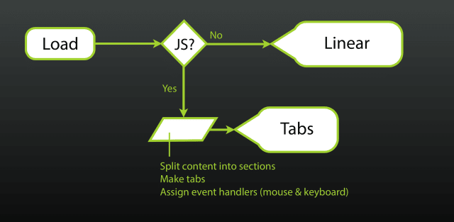
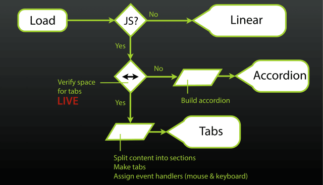
Here’s an example from my Beyond Responsive workshop that illustrates the evolution of a tabbed interface Ix Map from basic into something that is far more appropriate for differently-sized screens:
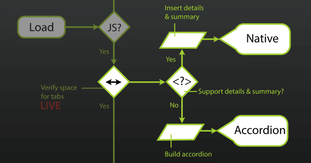
details/summary support and use the functionality if available.Simple, Powerful
Ix Maps have been incredibly useful to me and the dozens of teams I’ve worked with. They’ve helped us explore innovative ways to solve design challenges and have been an amazing touchstone to organize our work around. Give them a shot and I’m sure you’ll discover lots of ways to put them to use in your own projects.
Comments
Note: These are comments exported from my old blog. Going forward, replies to my posts are only possible via webmentions.Joseph R. B. Taylor
Aaron, thanks for the reminder about these simple diagrams. I frequently have to take return requirements back to their author to explain they need to augment them to consider things like screen size etc.
They often forget that the sites we work on are responsive, let alone whether the interface would break without javascript running.
These examples would replace a lot of repetitive typing on my end.
Webmentions
Likes
Shares