
Anyone who’s seen one of my forms talks knows how adamant I am about this: you can never trust the client! Doesn’t matter if that client is a web browser or your mobile app.
Anyone who’s seen one of my forms talks knows how adamant I am about this: you can never trust the client! Doesn’t matter if that client is a web browser or your mobile app.
As you’ve probably gathered if you’ve been following my work for the last few years, I’m super-jazzed about Progressive Web Apps. I think they have the potential to improve user experience, performance, access, and so much more for so many people. So I was stoked when Jeremy Keith asked me to write the foreword for his latest book, Going Offline, which tackles the complex topic of Service Workers with aplomb. With his permission (and A Book Apart’s), I’m reprinting the foreword here.
Last Tuesday, I gave a relatively new talk on web performance and optimization at An Event Apart in Seattle. The response to this talk has been tremendous both times I gave it, so I wanted to share the deck and relevant links here.

The folks at Canva have amassed a pretty expansive color tool that discusses various aspects—like history and associations—of a ridiculous number of colors. This resource also helps you build color sets around each of the colors by exploring complementary colors, analogous colors, and color triads that include it. Pretty cool stuff!
This is a thoroughly exhaustive breakdown of notification patterns and how to make them inclusive. Great work Heydon!

Eileen Webb on the accessibility issues created by “modern” storytelling on the web:
The issue usually isn’t the motion itself, or the existence of animation. The problem is a mismatch between my expectations for what I’m going to encounter on a webpage and what actually displays on that page.
She documents a handful of real issues and shows you how to resolve or at least mitigate them. She’s also included a bunch of real world examples of “dos” and “don’ts”. It’s well worth a read.
I love posts like this that get into the nitty-gritty detail of seemingly simple undertakings like updating a site’s font stack, especially one based on system fonts! There’s a lot to learn from this post and it’s well worth your time.

This excellent piece breaks down many of the issues around what it means (in the larger, societal sense) to store information digitally.
In the 21st century, more and more information is “born digital” and will stay that way, prone to decay or disappearance as servers, software, Web technologies, and computer languages break down. The task of internet archivists has developed a significance far beyond what anyone could have imagined in 2001, when the Internet Archive first cranked up the Wayback Machine and began collecting Web pages…
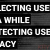
What I want is a way that both sides can get what they want: companies and projects can be data-driven, and users don’t get their privacy compromised.
Amen.
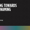
This is an excellent round up of excellent naming recommendations for writing more readable code.