There Can Be Only One, Redux

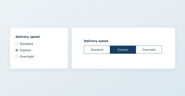
Back in 2022, I wrote “There can be only one: Options for building ‘choose one’ fields” for HTMHell. The interaction sounds simple—pick one option from a list—but choosing the right HTML control involves a few tradeoffs.
A <select> is compact, but you generally need to open it to see the available choices. Radio buttons put all the options in front of you, making them easier to scan and compare, but the group typically requires more screen real estate.
What if we could maintain visibility while presenting the choices in a more compact way?
That’s where <form-multi-switch> comes in. It presents a radio group as connected segments: all the options remain visible, but a short set of labels can fit neatly into a single row. Under the hood, they’re still native radio buttons, retaining their accessibility and UI affordances.
Start with the radios
Imagine you’re checking out and you need to decide how to ship your purchase. Seeing the options allows you to compare them easily. The same is not true when they’re nestled in a dropdown.
Here’s how you can use <form-multi-switch> to upgrade a properly marked up set of radio controls:
<form-multi-switch>
  <fieldset>
    <legend>Shipping speed</legend>
    <label>
      <input type="radio" name="shipping" value="standard" checked />
      Standard (5-7 days) – $5
    </label>
    <label>
      <input type="radio" name="shipping" value="express" />
      Express (2-3 days) – $25
    </label>
    <label>
      <input type="radio" name="shipping" value="overnight" />
      Overnight – $50
    </label>
  </fieldset>
</form-multi-switch>
Here, the <fieldset> groups the choices and the <legend> names the group. Each radio has a <label>. They share a name, but have distinct values. Drop this group in a form and you’re off to the races.
Without JavaScript, you get the default experience: a working group of radio buttons. With the component loaded, however, the labels look like buttons in a segmented switch control.
The component keeps the radios, labels, and <fieldset> in the light DOM rather than mapping native behaviors to custom controls. As a nice bonus of this approach, the browser continues to manage keyboard navigation, validation, form submission, and reset.
That’s a lot of behavior I didn’t want to rewrite (or maintain).
Load the enhancement
You can install the package using npm:
npm install @aarongustafson/form-multi-switchThen import its registration module:
import "@aarongustafson/form-multi-switch/define.js";That import assumes your tooling can resolve package names. If you’re serving modules directly to the browser, use an import map or load the installed define.js file by URL instead.
You can also import the FormMultiSwitchElement class and register it yourself. That’s useful if you want to extend it—which is exactly what I’ve done with my theme switcher.
Let HTML do the work
As the name implies, this component isn’t limited to two or even three choices. Shipping speeds, display density, clothing sizes… if the request is for a user to “choose one of these,” it may be a good fit.
The presentation adapts to the space available. At 20rem and above, the default layout is a row; below that, the choices stack. That’s handled using container queries, not viewport breakpoints. This allows it to work just as well in a sidebar as it does in your main content.
The default styles are simple and I’ve tried to keep them minimally opinionated by relying on system colors. You can restyle it with CSS custom properties:
form-multi-switch {
  --multi-switch-radius: 999px;
  --multi-switch-padding: 0.6em 1em;
  --multi-switch-border: #173f63;
  --multi-switch-selected-background: #173f63;
  --multi-switch-selected-color: #fff;
}
The component’s styles live in a cascade layer named form-multi-switch, so your un-layered styles can override its normal declarations without a specificity wrestling match.
If you don’t want connected buttons, that’s cool too. The restyling examples include simple pill and underline examples and a slightly more complex, gridded shoe-size picker.
A choice can do something, too
Sometimes submitting a value is the whole job. Other times, changing the choice should update something immediately: a shipping estimate, perhaps, or the density of a list.
The radios emit their native events, of course, but the component also provides a custom form-multi-switch:change event. It carries the current value, previous value, and choice index in its detail object.
For behavior that belongs with the control, you can also supply a module via the script attribute:
<form-multi-switch script="/j/density-behavior.js">
  <fieldset>
    <legend>Display density</legend>
    <label>
      <input type="radio" name="density" value="comfortable" checked />
      Comfortable
    </label>
    <label>
      <input type="radio" name="density" value="compact" />
      Compact
    </label>
  </fieldset>
</form-multi-switch>
That module should export an initialize() function so the component can call it when booting. A reference to the control and an AbortSignal get passed in so you can connect your code to its behavior easily.
Here’s an example that adjusts the data-density attribute on the html element:
export function initialize(control, { signal }) {
  document.documentElement.dataset.density = control.value;

  control.addEventListener(
    "form-multi-switch:change",
    ({ detail }) => {
      document.documentElement.dataset.density = detail.value;
    },
    { signal },
  );
}
With that behavior in place, your CSS can adapt the layout according to the attribute value.
The component waits for the module—and its initializer—to finish before applying the segmented presentation. If loading or setup fails, authored radios keep their native appearance and remain usable. The failure also produces an error event and a console message.
The supplied AbortSignal lets event listeners clean themselves up when the component disconnects or needs to initialize again. If your behavior needs other cleanup, the initializer can return a synchronous cleanup function.
Don’t need fallback markup? No problem.
Handwritten HTML isn’t the only authoring option. You can also describe a generated group using attributes:
<form-multi-switch
  name="density"
  label="Display density"
  choices='[
    {"label":"Comfortable","value":"comfortable"},
    {"label":"Compact","value":"compact"}
  ]'
  value="comfortable"
></form-multi-switch>
There’s a JavaScript configure() method as well, if the choices come from application data.
Those options depend on JavaScript to create the controls. They’re conveniences, not equivalent fallbacks. If the choice needs to be available before JavaScript runs—or when it doesn’t—write the radios. This approach should be reserved for JavaScript-dependent features only.
Worth noting: If you supply your own <fieldset>, it takes precedence over the generated-group configuration. There’s no need to maintain a second list of choices in JSON.
Give it a spin
The live demos cover shipping choices, sizes, custom styles, icons, and different languages and scripts.
Head over to the project repository for the full API, styling hooks, and installation options. And if you find a useful application for it, let me know. I’d love to see what you build.
Webmentions
Likes
Shares