Theme Switching Made Easy

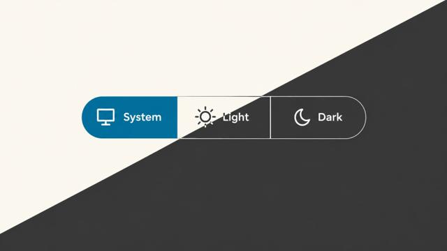
If you’ve used the theme switcher on this site, you may notice it works a little differently now.
There’s been a lot of discussion lately about whether theme controls should offer two states or three. Bramus has made the case for three states, while Lea has argued that two are enough.
That discussion prompted me to revisit the way I’ve been managing themes on this site. I’d supported two themes—dark and light—and neglected the system setting entirely. I wanted to rectify that and felt the urge to build a web component to make it reusable: <theme-switcher>.
Fun fact: The whole reason I built <form-multi-switch>, which I posted about yesterday, was to provide the foundation to make <theme-switcher> a reality. If you find this component useful or interesting, you should really check <form-multi-switch> out too.
How I’m using it
Here’s the markup I’m using inside this site’s theme <dialog>:
<theme-switcher class="theme-icons" label="Color theme"></theme-switcher>Once its JavaScript loads and the component boots, it generates a <fieldset> with a “Color theme” <legend> and the three standard choices: System, Light, and Dark. This minimal version has no usable controls if JavaScript fails; you can also supply your own radio buttons as a fallback, but that only makes sense if you’re planning to process it on the server side as a fallback (which I’m not).
The theme-icons class is my own styling hook, not a requirement. I use it to add decorative icons alongside the text labels. My <dialog> supplies the surrounding interaction; the component doesn’t create a <dialog> or its opener.
When someone makes a choice, the component writes it to the <html> element as data-theme:
<html data-theme="dark">That’s it. Not really, but pretty much. It doesn’t impose a theme or set any CSS rules; it just adds a signal for CSS to respond to.
Here’s a simple example of how you could do that, using browser-provided system colors:
:root {
  color-scheme: light dark;
}

:root[data-theme="light"] {
  color-scheme: light;
}

:root[data-theme="dark"] {
  color-scheme: dark;
}

body {
  background: Canvas;
  color: CanvasText;
}
With System selected, the first rule lets the browser choose a color scheme based on the user’s preference; no media query is needed for this example. Selecting Light or Dark limits the browser to that scheme instead. If you’re defining your own palettes with a prefers-color-scheme media query, scope it to :root[data-theme="system"] so it doesn’t undo an explicit user choice on your site.
Need additional themes? No problem
System, Light, and Dark aren’t the only options. If you want to offer a Sepia theme, for instance, you can supply the choices as JSON in the choices attribute:
<theme-switcher
  label="Color theme"
  choices='[
    {"label": "System", "value": "system"},
    {"label": "Light", "value": "light"},
    {"label": "Dark", "value": "dark"},
    {"label": "Sepia", "value": "sepia"}
  ]'
></theme-switcher>
The choices attribute replaces the default choices, and the component requires you to include system, light, and dark alongside any extras. Each choice has a text label and a unique value. Selecting Sepia sets data-theme="sepia" on <html>; then you supply the colors using :root[data-theme="sepia"] in your CSS.
Remembering a user’s preference
By default, <theme-switcher> saves a user’s preference in localStorage, using the key theme-switcher. A valid saved preference takes precedence over any author-provided defaults. If you’d like your server to have access to the preference too, you can mirror it in a cookie by adding the cookie attribute:
<theme-switcher cookie></theme-switcher>With cookie backing enabled, a valid localStorage value wins; a valid cookie provides a fallback when localStorage is unavailable or has no supported value. Your server can use that cookie to render the appropriate data-theme before sending a page to the browser.
If you include multiple instances of this component on a page, it keeps those theme controls in sync. With localStorage enabled and available, it also synchronizes tabs using the same storage key by listening for the browser’s storage event.
If you want to test the control without loading or saving a preference, add storage="none" to the component. That disables both localStorage and cookie reads and writes.
Preventing a theme flash during load
One challenge in building this component is that I don’t have control over how long it takes to boot and, therefore, when it reads the value stored in localStorage and applies it to the <html> element. It’s just a sad reality. That means the page may display its default theme first, then switch to the user’s saved preference if it’s different.
Adding a small <script> in the document <head> can prevent this theme flash by restoring the preference before the stylesheets load:
<script>
  try {
    const theme = localStorage.getItem('theme-switcher');
    if (['system', 'light', 'dark'].includes(theme)) {
      document.documentElement.setAttribute('data-theme', theme);
    }
  } catch (error) {
    console.warn('Could not restore the saved theme.', error);
  }
</script>
This code and an alternative that reads the cookie as a fallback are available in the project documentation.
Note: If you add custom choices to your <theme-switcher> configuration, include their values in the array above too. Otherwise, the script won’t restore those choices before the component boots.
Preference and appearance
If another component or part of your page needs to know when the theme changes, the component exposes a custom event that carries information about the preference chosen:
const switcher = document.querySelector("theme-switcher");

switcher.addEventListener("theme-switcher:change", ({ detail }) => {
  console.log(detail.value, detail.resolvedTheme, detail.source);
});
The event’s resolvedTheme tells you which theme the preference resolves to. If a user chooses System and their device is in dark mode, value will be system and resolvedTheme will be dark. If the device changes to light, resolvedTheme changes while value remains system. The component still leaves the actual appearance to your CSS.
That’s useful for things CSS can’t handle, like redrawing a chart. For ordinary page styling, though, the data-theme attribute and CSS are generally all you need.
Try it here—or elsewhere
You can try the control on this site, or explore the standalone demos:
The repository has the full API and detailed configuration options. If you try it, please let me know how it goes.
Webmentions
Likes
Shares