System Colors Need to Work Together

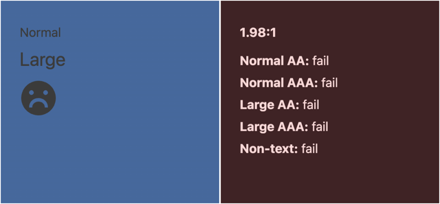
While testing out a recent web component, I discovered the demo I’d built made active buttons totally inaccessible, but only on Android in dark mode. I was baffled because I intentionally use system colors in all my web components and their demos. In the browsers I’d been testing, the pair looked great in both dark and light themes, but over on my phone it was a different story.
In Chrome’s dark mode on Android, HighlightText is a mid-tone grey. Highlight is a mid-tone blue. The contrast was abysmal—a mere 1.98:1, failing all five contrast thresholds in the Web Content Accessibility Guidelines (WCAG). I wish I could say it was the first time I’d stumbled on this kind of issue. A week or so earlier, a user reported similar trouble in my tabbed interface demo with Windows in forced-color mode. I’d mistakenly thought forced-color mode was the primary issue. It wasn’t.
In both cases, I’d expected colors named for foreground and background roles to work together. Apparently, that was asking too much.
These experiences prompted me to build the System Color Study: a resource for comparing browser-provided colors and their intended pairings across browsers, operating systems, and preferences. I’m using it to inform my component work; I hope it’ll help you too.
Names clearly aren’t enough to go on
CSS system colors describe jobs rather than particular hues. Canvas is a page background; CanvasText is text on that background. ButtonText goes with ButtonFace, FieldText with Field, and HighlightText with Highlight. The browser supplies the actual color value based on the operating system and user preferences.
That’s appealing when you’re building reusable components. Rather than having to define a palette, you can use colors intended for the roles you need, with room for people’s preferences. It also allows you to create UIs that feel less opinionated and more like part of the web platform. Sadly, as my examples illustrate, the names alone don’t tell you whether someone will be able to read the result.
Looking at colors together
The study presents saved observations across light, dark, forced-color, and more-contrast settings. Its individual-color table shows resolved sRGB hex values, so you can compare a keyword across environments. This table lets you see how the color varies across the recorded environments without having to test each one yourself.
To really understand where all the jagged edges are, we need to compare what happens when we combine these colors, not just their values in isolation.
The paired examples table puts each explicit foreground on its intended background, with “Normal” and “Large” text examples and an SVG face icon drawn in the foreground color. This lets you see how the pairs work (or don’t) across myriad browser, OS, and preference combinations.
Next to each pairing is a column containing its contrast ratio and results against five WCAG contrast thresholds: normal-text AA, normal-text AAA, large-text AA, large-text AAA, and non-text. To make scanning the table a little easier, these contrast cells have a green background if all five thresholds pass, an amber background if some pass, and a red one if all five fail. The SVG face is smiling, neutral, or frowning based on these results too.
A few additional notes:
- Cells with
N/Aindicate that the system color keyword is unsupported in that browser/OS combination. - Semi-transparent colors are measured over the recorded
Canvasvalue; putting them against another color—system or otherwise—may change the contrast.
Using the evidence
While building my web components, I’m using the study to check which intended pairs hold up, rather than trusting their names. You can use it the same way for components or entire websites: find the roles you need, inspect their pairings, then test them in your UI.
At the end of the study, I’ve included a list of color recommendations based on the data I currently have. To show up in this list, a pair must pass normal-text AA in every recorded observation, checked separately across ordinary light, ordinary dark, forced-color, and more-contrast groups, with at least one observation in each. That doesn’t mean these color pairings are guaranteed to work, but it should give you an understanding of which pairs are safer to use. As always: be sure to test.
A request for browser and OS implementers
I’d like browser and operating-system teams to use these observations as reproducible starting points to correct their system color implementations too. All modern system color keywords should be consistently supported, and intended foreground/background pairs should be accessible by default.
Proper contrast is crucial in forced-color modes. Forced colors are an accessibility feature people use to make interfaces more usable for them. If a default palette supplies text and background colors that are difficult to read together, you’re undermining the very purpose of that color mode.
Here’s my wish list of fixes. I plan to reach out to these teams, but if you want to hit them up on social media too, it might help make these fixes a priority:
- Chrome:
HighlightTextonHighlight(Android dark; Windows light);ActiveTextonCanvas(Android, iPadOS, and macOS light);AccentColorTextonAccentColor(macOS and Windows, including Windows Contrast themes). Also support both accent-color keywords on Android. - Edge:
HighlightTextonHighlight(Android dark; Windows light);ActiveTextonCanvas(Android light; macOS increased-contrast light);AccentColorTextonAccentColor(macOS and Windows, including Windows Contrast themes). Also support both accent-color keywords on Android. - Firefox:
HighlightTextonHighlight(Android light; macOS light/dark and the recorded forced-color light configuration; Windows light);SelectedItemTextonSelectedItem(macOS and Windows light);ActiveTextonCanvas(Windows Aquatic, Desert, Dusk, and Night sky Contrast themes). - Safari:
ActiveTextonCanvas(macOS and iPadOS light).
I’m not asking every platform to adopt identical hues. I’m asking for the colors supplied for complementary roles to work together, without requiring authors to guess which browser’s defaults need repairing.
Add your browser to the study
If you read through the study and don’t see your browser/OS combo or preferences represented, please consider taking a snapshot of your system colors and submitting it. You can read through the capture protocol if you like, or jump straight to the data capture page I set up.
The process is straightforward:
- Verify the metadata. Check the recorded browser and OS versions against their About screens. Correct inferred values and remove any “verify” placeholders. If forced colors are active, name the theme. Use Notes to describe any customizations you have in place.
- Capture the colors. “Capture light and dark system colors” creates one snapshot containing both requested CSS schemes. Download the JSON or use Copy JSON, and review it before submitting.
- Submit the snapshot. Choose “Submit this snapshot on GitHub” to file an issue against the project with your capture data. Paste the full JSON into the dedicated field, and confirm you’ve reviewed the metadata.
If you want to contribute additional evidence, switch browsers or devices, or change an OS preference, then capture again. Submit all snapshots separately. I’m not capturing any telemetry or automatically uploading anything; you can review the captured data and decide whether you want to share it.
The study’s repository contains the complete study source and methodology. Please check out the study and consider contributing an observation, especially from environments I haven’t recorded, such as Linux distributions. I’d love for us to have even more evidence regarding the accessibility of the colors we (and our customers) rely on.
Webmentions
Likes
Shares