
This is a drum I’ve been beating for a while: Not all smartphones are created equal. You should be testing on low-spec smartphones.
This is a drum I’ve been beating for a while: Not all smartphones are created equal. You should be testing on low-spec smartphones.

Smart thinking (as always) from Jason Grigsby. This time he’s asking the right questions about context in the age of tiny screens (smartwatches) and giant ones (smart TVs).
I’ve been complaining about “man in the middle” attacks brought on by internet service providers a bunch over the last year. The only way to keep uninvited third parties from injecting JavaScript and more—potentially screwing up your page—is to move to HTTPS. So, as much as it pains me to abandon good old fashioned HTTP, I’ve decided to lock things down a bit.
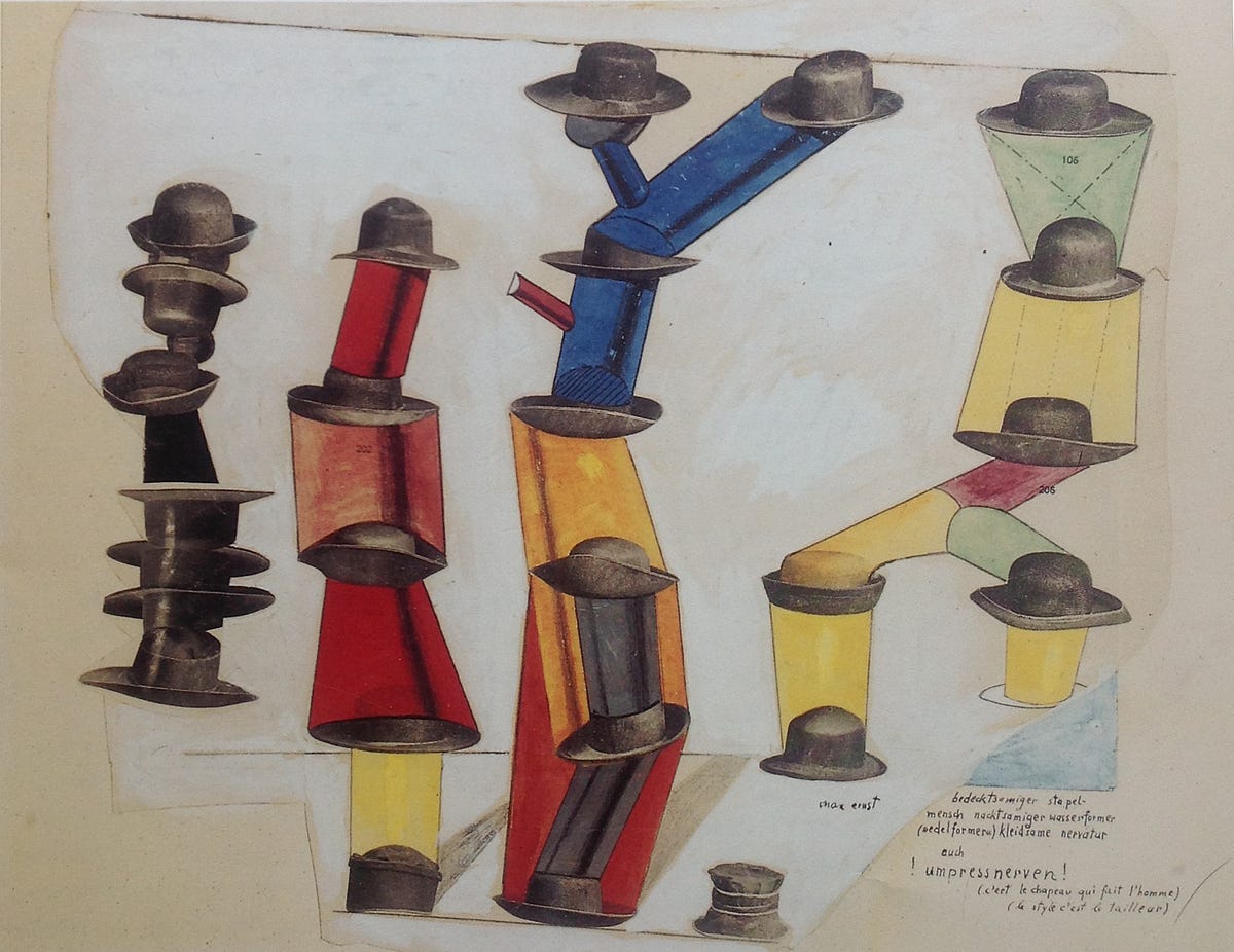
Fantastic history of “Information Architecture” as a practice, with an eye for where it’s heading. Great work Christina Wodtke!
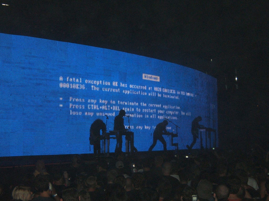
This is a fantastic rant from Thomas Fuchs on error messages and how to do them well (with lots of examples of how not to write error messages).

A nice overview of small screen design trends with backgrounds as to why these approaches work well.

There’s some really good forms advice in here. Just be careful when manipulating the tab flow.
I’ve talked about this before: As web designers, we can’t trust the network. Sure, we have to contend with mobile data “dead zones” and dropped connections as our users move about throughout the day, but there’s a lot more to the network that’s beyond our control.

Not on the <form>. Noted.

Experiments in radio and checkbox resizing. It’s a sad state of affairs. The small hit targets are why I recommend adding negative margins above and below the <label>, coupled with equal padding top and bottom. It’s a recommendation from my forms talk that I will write up soon.