[L]et’s stop thinking of the constraints of progressive enhancement as a creativity killer. We too can use the constraints to come up with genuinely creative ways to get round problems and become better designers.
Amen.
[L]et’s stop thinking of the constraints of progressive enhancement as a creativity killer. We too can use the constraints to come up with genuinely creative ways to get round problems and become better designers.
Amen.
I started attending SXSW in 1997 as a music journalist. I ran a small indie music & entertainment rag in Florida at the time and was invited by one of my publicist friends (I’m looking at you, Rey) to crash in his room and check out the festival/conference. I scored a press badge and saw some amazing shows, but Interactive wasn’t really on my radar.

An interface inventory is similar to a content inventory, only instead of sifting through and categorizing content, you’re taking stock and categorizing the components making up your website, app, intranet, hoobadyboop, or whatever (it doesn’t matter).

From first use to navigation to lower-level screens, the motif should be infused throughout the customer’s experience. By making it a part of the on-boarding experience in particular, you’ll help to welcome new users in a natural, unforced way, rather than having to rely on instructional coaching…

Well written and helpful, this article explains the root causes of existential depression (which is not just a childhood issue) and how to help people cope with it.

Rather than the site relying on a particular payment provider,
requestAutocompleterequests payment details from the browser, which stores them on the user’s behalf.
Nice.

Just what it says on the tin.
This is a really nice overview of SVG pros and cons.
What follows is the foreword I wrote for A Web For Everyone: Designing Accessible User Experiences by Sarah Horton & Whitney Quesenbery. If you work on the web at all, you need this book. It’s an amazingly easy read that brings humanity to an often dry subject and I am very thankful to have been a part of it.
Some of you might find it hard to believe, but I began working with adaptive layouts way back in 2005. I was working on project for the Connecticut Department of Transportation and my primary design made heavy use of fixed positioning and white space. Sadly this is the only screenshot I have of the now-defunct project:
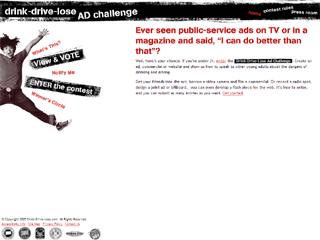
The layout really started to break down on smaller screens—we had quite a few 800x600 monitors to deal with back in the day—so, inspired by Joe Clark’s A List Apart article “Big, Stark & Chunky,” I created an alternate stylesheet that rearranged the page layout, enlarged the text, and improved the reading experience. Sadly, I don’t have a screenshot of what that looked like, but here’s a decent approximation (sans background images), courtesy of the Wayback Machine: