Aaron Gustafson

This site is undergoing an open redesign, so if it looks strange, that’s why.

How Letterspacing Can Make All Caps Easier to Read

Published in UX Movement
Saved on 21 April 2016 by Aaron Gustafson

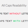
“All caps” text gets abused pretty regularly. This article gets into the details of why proper letter spacing is crucial for the legibility of text in all caps.

Read on UX Movement

If you liked this post, would you mind sharing it?
Share on Twitter Post on Facebook Share on LinkedIn Share on Pinterest


Here’s what you can find on this site:

  • A Bit About Me
  • Entries in My Notebook
  • A List of My Speaking Engagements
  • A List of My Publications
  • Links to Interviews I’ve Given
  • The Requisite Contact Form
  • Search

Did you spot a typo or error? Eesh. Would you mind fixing it for me? You’re so awesome.

The content of this site is licensed under Creative Commons. Interested in how this site was made? Check this out.