<?xml version="1.0" encoding="utf-8"?><?xml-stylesheet type="text/css" href="https://www.aaron-gustafson.com/c/feed.min.css" ?><feed xmlns="http://www.w3.org/2005/Atom"
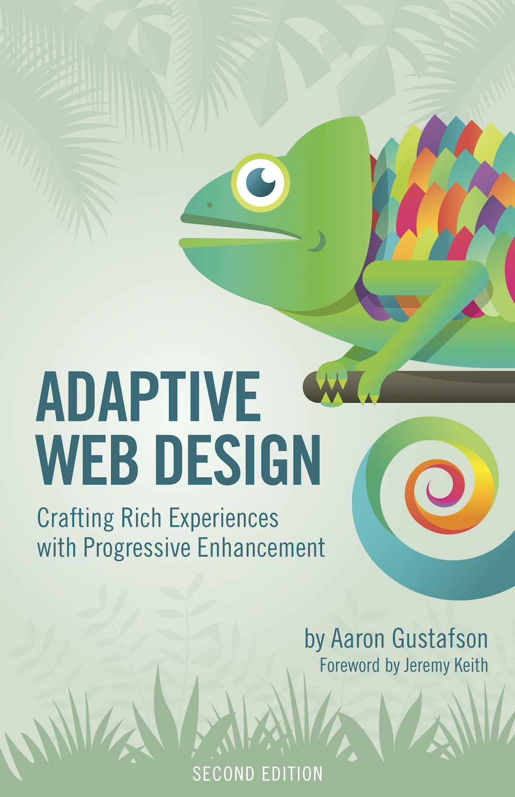
      xmlns:amg="https://www.aaron-gustafson.com.com/amg-dtd/"><title>Aaron Gustafson: Content tagged Adaptive Web Design</title><subtitle>The latest 20 posts and links tagged Adaptive Web Design.</subtitle><id>https://www.aaron-gustafson.com</id><link href="https://www.aaron-gustafson.com/feeds/adaptive-web-design.xml" rel="self"/><link href="https://www.aaron-gustafson.com"/><author><name>Aaron Gustafson</name><uri>https://www.aaron-gustafson.com</uri></author><updated>2016-02-21T23:56:05Z</updated><entry><id>https://www.aaron-gustafson.com/notebook/planning-adaptive-interfaces-the-workshop/</id><title type="html"><![CDATA[✍🏻 Planning Adaptive Interfaces: The Workshop]]></title><link href="https://www.aaron-gustafson.com/notebook/planning-adaptive-interfaces-the-workshop/" rel="alternate" type="text/html" /><published>2016-02-21T23:56:05Z</published><content type="html" xml:base="https://www.aaron-gustafson.com"><![CDATA[<p>For the last few years I’ve been running a workshop alternately titled “Planning Adaptive Interfaces” or “Beyond Responsive”, depending on the conference. It’s been one of my favorite workshops to run for a number of reasons, but before I get into that, let me explain what it is and how it works.</p><p>I think we all recognize how much Ethan’s seminal article <a href="http://alistapart.com/article/responsive-web-design">“Responsive Web Design”</a> (and <a href="https://abookapart.com/products/responsive-web-design">his follow-up book</a>) shook up our industry. It changed the way we look at visual design and kindled (or in some cases re-kindled) an interest in catering an experience to mobile devices. But simply incorporating responsive design’s three core strategies—fluid grids, flexible media, media queries—is not the goal; meeting our user’s needs is. Responsive design is not an end in itself… it’s just the beginning.</p><p>We need to embrace the heterogenous nature of the Web—myriad connected devices with vastly different screen sizes (if they even have screens), network connectivity, and capabilities in use by countless individuals, each with their own special needs—and craft experiences that will work anywhere at any time. We need to build robust systems that adapt in ways far beyond aesthetics. I designed this workshop to explore the rich variety of use cases that often get overlooked in the course of building web projects and to show how we can begin considering them as early as possible.</p><p>When I was starting out, I gave “workshops” that basically amounted to a half-day or (worse) a full day for folks to listen to me blather on about one topic or another. People liked them, but I wouldn’t call them fun. And, in hindsight, I question how much value people got from an extended survey of what’s possible without the opportunity to put that knowledge to use. Workshops should encourage attendees to get their hand dirty.</p><p>I kick this workshop off with a relatively brief discussion of the considerations that we should be aware of—beyond screen size and pixel density. I also provide examples of how to adapt interfaces so they rise to meet our customers’ needs. Then I throw out a list of common interface patterns—modals, tabs, etc.—and turn the floor over to the attendees, asking them to build small teams that each examine a single pattern in detail with these considerations in mind. They then spend the rest of the workshop planning out how that interface would adapt to consider factors like accessibility, screen dimensions, device capabilities, JavaScript availability, and so on. All the while, I circulate among the groups, asking and answering questions, pressing them to go a little further with each iteration. Some teams sketch, some prototype, and all spend a lot of time debating, which is awesome!</p><p>I leave the last hour or so for a group discussion of what each team’s accomplished. It gives them a chance to talk through their approach, what they learned, what their pain points were, and how they overcame them. Not does it celebrate their work, but it helps the other attendees discover novel ways to approach these common UI constructs.</p><p>It’s been a blast and I have learned so much from the teams I’ve coached. Each workshop is completely different because each group of attendees is completely different. I’ve run it with groups ranging from 12 to 120, for internal teams at large companies to mixed audiences from all over the world. Everyone who has attended one of these workshops has brought a unique perspective and helped us all get better at our jobs. That’s been one of the best parts of this experience for me.</p><p>If a workshop like this sounds up your alley, I’ll be giving it a few more times in 2016. Your next opportunity will be at <a href="http://enhanceconf.com/workshop.html">EnhanceConf in London in early March</a>. Later in the year, I’ll be giving it as part of <a href="https://buildright.io/maker-series/2016/aaron-gustafson">Sparkbox’s Build Right: Maker Series</a>. I’d love the opportunity to work with you if you can make it!</p>]]></content><amg:summary><![CDATA[For the last few years I’ve been running a workshop alternately titled “Planning Adaptive Interfaces” or “Beyond Responsive”, depending on the conference. It’s been one of my favorite workshops to run for a number of reasons, but before I get into that, let me explain what it is and how it works.]]></amg:summary><summary type="html"><![CDATA[<p>For the last few years I’ve been running a workshop alternately titled “Planning Adaptive Interfaces” or “Beyond Responsive”, depending on the conference. It’s been one of my favorite workshops to run for a number of reasons, but before I get into that, let me explain what it is and how it works.</p>]]></summary><category term="conferences" /><category term="progressive enhancement" /><category term="responsive web design" /><category term="pattern libraries" /><category term="empathy" /><category term="Adaptive Web Design" /></entry><entry><id>https://www.aaron-gustafson.com/notebook/adaptive-web-design-folded-and-gathered/</id><title type="html"><![CDATA[✍🏻 <cite>Adaptive Web Design</cite>: Folded &amp; Gathered]]></title><link href="https://www.aaron-gustafson.com/notebook/adaptive-web-design-folded-and-gathered/" rel="alternate" type="text/html" /><published>2015-11-12T18:16:27Z</published><content type="html" xml:base="https://www.aaron-gustafson.com"><![CDATA[<p>I just got this photo from <a href="https://www.linkedin.com/pub/tracey-croom/13/a6/985">Tracey Croom</a>, my production editor on <a href="http://adaptivewebdesign.info/2nd-edition/">the Second Edition of <cite>Adaptive Web Design</cite></a> and I wanted to share it with you. Production is almost done and I should be getting my bound copies soon. I’m so excited!</p><figure id="fig-2015-11-12-01" class="media-container"><p><img src="https://www.aaron-gustafson.com/i/posts/2015-11-12/01.jpg" alt=""></p><figcaption>A photo of the folded &amp; gathered pages of <cite>Adaptive Web Design</cite>’s Second Edition.</figcaption></figure>]]></content><amg:summary><![CDATA[I just got this photo from Tracey Croom, my production editor on the Second Edition of Adaptive Web Design and I wanted to share it with you.]]></amg:summary><summary type="html"><![CDATA[<p>I just got this photo from Tracey Croom, my production editor on the Second Edition of Adaptive Web Design and I wanted to share it with you.</p>]]></summary><category term="Adaptive Web Design" /><category term="writing" /></entry><entry><id>https://www.aaron-gustafson.com/notebook/on-adaptive-web-designs-second-edition/</id><title type="html"><![CDATA[✍🏻 On <cite>Adaptive Web Design</cite>’s Second Edition]]></title><link href="https://www.aaron-gustafson.com/notebook/on-adaptive-web-designs-second-edition/" rel="alternate" type="text/html" /><published>2015-10-20T15:43:16Z</published><content type="html" xml:base="https://www.aaron-gustafson.com"><![CDATA[<p>I wrote the bulk of <cite>Adaptive Web Design</cite> in early 2010 while taking a much-needed break from client projects. I had originally slated for it to be released just before the holidays that year, but life happened and the book did not make it out into the world until mid-2011. Six months is a long time in the technical world, and especially on the Web. A year is forever.</p><style media="only screen">.figure–cover img{width:50%;margin-left:auto;margin-right:auto;}@media (min-width:37.5em){.figure–cover img{float:right;width:250px;margin:0 0 1em 1em;}}</style><figure id="fig-2015-10-20-01" class="figure figure--cover"><a href="https://adaptivewebdesign.info/2nd-edition/"><p><img src="https://adaptivewebdesign.info/2nd-edition/cover-1024.jpg" alt=""> { .book__cover }</p><p></a></figure></p><p>Thankfully, <cite>Adaptive Web Design</cite> was never meant to be a technique book. As web design books go, technique books have perhaps the shortest lifespan. Heck, some are even out of date before they come off the press. Rather than going down that road, I consciously positioned my book as a web design philosophy book—the code samples were merely there to demonstrate how the philosophy could be applied to your work. That simple choice is probably why <cite>Adaptive Web Design</cite> continued to have strong sales year-after-year and it’s the reason that book continues to rank highly on many recommended reading lists.</p><p>Despite the accolades and the obvious longevity the First Edition has enjoyed, I’ve had the itch to update it for the last year and a half. It’s not that the content is stale, it’s more that I’ve adjusted how I frame certain ideas within the topic of progressive enhancement. For instance, I regret my decision to sequester accessibility within its own chapter in the First Edition; it made it too easy to skip, to consider an after thought, a bolt-on. I wish I had integrated it into every chapter. Because of when I wrote it, there was also a lot of stuff I didn’t get the chance to cover. For instance, HTML5 was also pretty new (and not yet a Recommendation) at the time and ARIA was still largely in flux, so I was only able to touch on bits and pieces of those. Ethan Marcotte’s seminal article “<a href="http://alistapart.com/article/responsive-web-design">Responsive Web Design</a>”—and <a href="http://abookapart.com/products/responsive-web-design">his follow-up book by the same name</a>—came out after I’d written my CSS chapter, so I didn’t have the opportunity to demonstrate how that approach aligned with progressive enhancement.<sup class="footnote-ref"><a href="#fn1" id="fnref1">1</a></sup> Similarly, there were a lot Ajax-driven sites out there, but the “single-page app” movement hadn’t quite begun yet, so I hadn’t been able to square it with the progressive enhancement philosophy either. Similarly, the argument for progressive enhancement hadn’t yet been boiled down to “no JavaScript”, so I hadn’t even thought to address that.</p><p>When I mused about the Second Edition, I knew I wanted it to be more comprehensive and thorough. I had skimmed over content strategy the first time round—another regret—so I opted to give content its own chapter this time. I integrated accessibility into each and every chapter, showing how considering the “special needs” of your users can be accomplished with the copy you author, HTML you write, CSS you apply, and JavaScript enhancements you make. (Accessibility is important and everyone needs to be exposed to its considerations, so I am very happy about that decision.) Finally, from an organizational standpoint, I knew I didn’t want to focus the lessons around a “project site”—I wanted to pull great examples of progressive enhancement from the wild and celebrate them.</p><p>My target length for the Second Edition was a modest increase from 135 pages to around 160. When all is said and done, it’ll be closer to 250. It’s a lot of content, but I did my best to keep it approachable, like a really good conversation we might share over a few drinks.<sup class="footnote-ref"><a href="#fn2" id="fnref2">2</a></sup></p><p>I finished writing the Second Edition about a month and a half ago and have read and re-read it several times since then. I’m quite happy with the end result and I hope you will be too. I plan to get some of the content out there for you to read before deciding whether to purchase it, but in the meantime you can <a href="http://adaptivewebdesign.info/2nd-edition/">read more about it on the updated book site</a>. I also encourage you to check out <a href="http://adaptivewebdesign.info/2nd-edition/read/foreword.html">Jeremy Keith’s amazing Foreword</a>—which, admittedly, made me a little misty—and <a href="http://adaptivewebdesign.info/2nd-edition/reviews/">the sweet things Ethan and Tim Kadlec had to say about the book</a> after reading it.</p><hr class="footnotes-sep"><section class="footnotes"><h4 class="hidden">Footnotes</h4><ol class="footnotes-list"><li id="fn1" class="footnote-item"><p>Interestingly enough, Ethan’s book came out around the same time as <cite>Adaptive Web Design</cite>, leading many people to think they were conflicting approaches, <a href="http://blog.easy-designs.net/archives/on-adaptive-vs-responsive-web-design/">which is hardly the case</a>. <a href="#fnref1" class="footnote-backref">↩︎</a></p></li><li id="fn2" class="footnote-item"><p>I like boozy cocktails, in case you were wondering. <a href="#fnref2" class="footnote-backref">↩︎</a></p></li></ol></section>]]></content><amg:summary><![CDATA[A little background as to why I wrote the Second Edition of Adaptive Web Design and what you can expect from it.]]></amg:summary><summary type="html"><![CDATA[<p>A little background as to why I wrote the Second Edition of Adaptive Web Design and what you can expect from it.</p>]]></summary><category term="Adaptive Web Design" /><category term="progressive enhancement" /></entry><entry><id>https://www.aaron-gustafson.com/notebook/revisiting-and-releasing-adaptive-web-design/</id><title type="html"><![CDATA[✍🏻 Revisiting (and Releasing) <cite>Adaptive Web Design</cite>]]></title><link href="https://www.aaron-gustafson.com/notebook/revisiting-and-releasing-adaptive-web-design/" rel="alternate" type="text/html" /><published>2015-01-05T19:10:49Z</published><content type="html" xml:base="https://www.aaron-gustafson.com"><![CDATA[<p>As you probably know, back in 2011 Easy Readers published my first solo book: <a href="http://adaptivewebdesign.info"><cite>Adaptive Web Design</cite></a>. It was an immediate hit and the response to continues to be tremendous even though it will turn four this coming May (which has to be like 80 in technology book years… many are outdated before they are even released).</p><blockquote><p>Time and again, I return to @AaronGustafson’s “Adaptive Web Design”. Like a North Star for user-focused web design.</p></blockquote><p>I think one of the main reasons the book has remained relevant for so long is because at its core, <cite>Adaptive Web Design</cite> is a <em>philosophy</em> book. Sure, there are some code examples here and there, but they only serve to demonstrate how you can apply progressive enhancement in your work. The philosophy of progressive enhancement works and only continues to demonstrate its brilliance with each new Web-enabled screen that debuts in the ever-expanding global marketplace. In fact, I’ll go out on a limb and declare that progressive enhancement is probably even more relevant today than it was when I wrote <cite>Adaptive Web Design</cite> in 2010.</p><p>As such, I’ve been thinking a lot about an update. So much has happened since mid-2010 when I was writing the book. Heck, I didn’t even address Responsive Web Design and only touched a little on mobile. Then there are things like single-page apps &amp; isomorphic JavaScript I’d love to discuss. <a href="http://opengraphprotocol.org/">Open Graph</a> &amp; <a href="http://schema.org/">Schema.org</a>… new tweaks to <a href="http://www.w3.org/WAI/intro/aria.php">the ARIA spec</a>… <a href="http://www.w3.org/html/wg/drafts/html/master/embedded-content.html#the-picture-element"><code>picture</code></a>, <a href="http://www.w3.org/html/wg/drafts/html/master/embedded-content.html#attr-img-srcset"><code>srcset</code></a> &amp; <a href="http://www.w3.org/html/wg/drafts/html/master/embedded-content.html#attr-img-sizes"><code>sizes</code></a>… the <a href="http://www.w3.org/TR/shadow-dom/">shadow DOM</a>… <a href="http://www.w3.org/TR/components-intro/">web components</a>… the list goes on and on. Progressive enhancement can help you better understand the pros and cons of all of these new advances and help you employ them while simultaneously keeping your projects on time and on budget.</p><p>My hope is that the second edition of <cite>Adaptive Web Design</cite> will be out an in your hands by the end of 2015. But in the meantime, <a href="https://adactio.com/journal/4956">taking a page from Jeremy</a>, I felt it was time to give away the first edition. You can now <a href="http://adaptivewebdesign.info/1st-edition/">read <cite>Adaptive Web Design</cite></a>, in it’s entirety, from the comfort of your own browser… for free.</p><p>The HTML version of <cite>Adaptive Web Design</cite> is a nearly direct port of the XHTML I wrote for the hand-coded ePub. I made a few tweaks to make it a little more readable in the browser, but it’s all there including the videos. And yes, it makes use of progressive enhancement.</p><p>I hope you enjoy reading it as much as I enjoyed writing it and I look forward to getting you the revised and expanded second edition in the not to distant future.</p><p>PS - Easy Readers closed up shop at the end of 2014 and delivered the remaining paperback copies—of which there are only 50 or so—to me. If you missed out on getting a copy and would like to purchase one, <a href="/contact/">drop me a line</a> and I can sell you one. I’ll even sign it for you!</p>]]></content><amg:summary><![CDATA[I am currently working on the second edition of Adaptive Web Design, so it seemed only natural to release the entirety of the first edition, for free as HTML. And yes, the book is progressively enhanced.]]></amg:summary><summary type="html"><![CDATA[<p>I am currently working on the second edition of Adaptive Web Design, so it seemed only natural to release the entirety of the first edition, for free as HTML. And yes, the book is progressively enhanced.</p>]]></summary><category term="web design" /><category term="writing" /><category term="Adaptive Web Design" /></entry><entry><id>https://www.aaron-gustafson.com/notebook/adaptive-design-empathy-and-beating-creative-block/</id><title type="html"><![CDATA[✍🏻 Adaptive Design, Empathy & Beating Creative Block]]></title><link href="https://www.aaron-gustafson.com/notebook/adaptive-design-empathy-and-beating-creative-block/" rel="alternate" type="text/html" /><published>2014-04-01T14:33:00Z</published><content type="html" xml:base="https://www.aaron-gustafson.com"><![CDATA[<p>Lately I’ve been doing a few more podcasts, local events, and interviews. Here’s a round-up of a few that posted in the last week or so:</p><p><strong><a href="http://www.modern.ie/en-us/podcast/modernie-podcast-with-aaron-gustafson">The modern.IE Podcast</a></strong><br/>Josh Holmes interviewed me about adaptive design, progressive enhancement, and a wide range of other things.</p><p><a href="http://www.pechakucha.org/cities/chattanooga/events/526e68fc4f5c29f968000004"><strong>PKNCHA#15</strong></a><br/>I did a PechaKucha talk on empathy and the golden rule last December. <a href="https://www.youtube.com/watch?v=6QlAj4_6m5s">The video is now on YouTube.</a></p><lite-youtube videoid="6QlAj4_6m5s" style="background-image: url('https://i.ytimg.com/vi/6QlAj4_6m5s/hqdefault.jpg');" params=""><a href="https://www.youtube.com/watch?v=6QlAj4_6m5s" class="lty-playbtn" title="Play Video"><span class="lyt-visually-hidden">Play Video</span></a></lite-youtube><p><a href="http://www.creativebloq.com/creativity/15-pro-techniques-beating-creative-block-3145683"><strong>15 Pro Techniques for Beating Creative Block</strong></a><br/>I give my thoughts on the topic, but you can also read the fantastic thoughts of Dan Rubin, Trent Walton, Derek Featherstone, and Rachel Shillcock.</p>]]></content><amg:summary><![CDATA[Lately I’ve been doing a few more podcasts, local events, and interviews. Here’s a round-up of a few that posted in the last week or so:]]></amg:summary><summary type="html"><![CDATA[<p>Lately I’ve been doing a few more podcasts, local events, and interviews. Here’s a round-up of a few that posted in the last week or so:</p>]]></summary><category term="presentations" /><category term="empathy" /><category term="Adaptive Web Design" /></entry><entry><id>https://www.aaron-gustafson.com/notebook/on-adaptive-vs-responsive-web-design/</id><title type="html"><![CDATA[✍🏻 On Adaptive vs. Responsive Web Design]]></title><link href="https://www.aaron-gustafson.com/notebook/on-adaptive-vs-responsive-web-design/" rel="alternate" type="text/html" /><published>2011-11-16T17:23:00Z</published><content type="html" xml:base="https://www.aaron-gustafson.com"><![CDATA[<p>In the past few months, I’ve spent an inordinate amount of time discussing the differences between the “adaptive” and “responsive” web design philosophies. Don’t get me wrong, I love having these discussions, but I felt the need to set the record straight: these two philosophies are not at odds, despite numerous blog posts and tweets to the contrary.</p><p><span class="initial quote">“</span>Responsive web design,” as <a href="http://www.alistapart.com/articles/responsive-web-design/">coined by Ethan Marcotte</a>, means “fluid grids, fluid images/media &amp; media queries.” “Adaptive web design,” as <a href="http://adaptivewebdesign.info">I use it</a>, is about creating interfaces that adapt to the user’s capabilities (in terms of both form <em>and</em> function). To me, “adaptive web design” is just another term for “<a href="http://en.wikipedia.org/wiki/Progressive_enhancement">progressive enhancement</a>” of which responsive web design can (an often should) be an integral part, but is a more holistic approach to web design in that it also takes into account varying levels of markup, CSS, JavaScript and assistive technology support.</p><p>For the record, I do think it’s important to draw a distinction between “adaptive web design” and “adaptive layouts” because “adaptive layouts” implies only the use of media queries, which may not be done in a progressively enhanced way. Adaptive layouts achieved in a mobile-first manner, however, are very likely progressive enhancement and, thereby, a means of “adaptive web design.<span class="final quote">”</span></p>]]></content><amg:summary><![CDATA[In the past few months, I’ve spent an inordinate amount of time discussing the differences between the “adaptive” and “responsive” web design philosophies. Don’t get me wrong, I love having these discussions, but I felt the need to set…]]></amg:summary><summary type="html"><![CDATA[<p>In the past few months, I’ve spent an inordinate amount of time discussing the differences between the “adaptive” and “responsive” web design philosophies. Don’t get me wrong, I love having these discussions, but I felt the need to set…</p>]]></summary><category term="Adaptive Web Design" /><category term="responsive web design" /><category term="progressive enhancement" /></entry><entry><id>https://www.aaron-gustafson.com/notebook/i-finally-wrote-a-book/</id><title type="html"><![CDATA[✍🏻 I (Finally) Wrote a Book]]></title><link href="https://www.aaron-gustafson.com/notebook/i-finally-wrote-a-book/" rel="alternate" type="text/html" /><published>2011-06-21T10:27:12Z</published><content type="html" xml:base="https://www.aaron-gustafson.com"><![CDATA[<p>Over the last five years, one of the most frequent questions I’ve gotten has been “When are you going to write a book?<span class="final quote">”</span></p><p>You see, I’ve been writing articles and contributing to other people’s books since some time in 2004. In that time, I’ve also presented at dozens of conferences on a variety of topics. The topics I’ve chosen for these endeavors have been all over the map, but the theme that seemed to link them all was progressive enhancement. It’s the philosophical underpinning of everything I do and a subject that gets me excited about coming to work every day. So, naturally, I decided to make that the topic of my first solo book: <a href="http://adaptivewebdesign.info"><cite>Adaptive Web Design: Crafting Rich Experiences with Progressive Enhancement</cite></a>.</p><figure><img alt="" src="/i/posts/2011-06-21/adaptive-web-design-stack.jpg"/></figure><p>This book has been writing itself in my head for the last four or five years, so it was a great feeling to finally commit it to “paper” when I began this process a little over a year ago. My primary goal in writing the book was to thoroughly explain what progressive enhancement is, why it works, and how to use it. It is not meant to be a technique book.</p><p>My reasoning is simple: People understand techniques that apply progressive enhancement, but techniques come and go (just like browsers do). With a solid understanding of the philosophy and mechanisms of progressive enhancement, our community will be better able to build adaptive websites that truly serve our users. In many ways, I strove to write a philosophy book. A philosophy book with code.</p><p>Anyway, after about a year of writing, editing, and production (coupled with the formation of a new publishing house, etc.), I’m very happy to have the book out there and into your hands. So far, <a href="http://susanjeanrobertson.com/geekery/progressive-enhancement-and-responsive-design/">your response</a><a href="https://twitter.com/AaronWinters916/status/79247698187911168">has</a><a href="https://twitter.com/#!/LarrySawyer/status/78301749575819264"> been</a><a href="http://http//www.456bereastreet.com/archive/201106/adaptive_web_design_book_review/">overwhelmingly positive</a>, making me feel like this is the book I was meant to write.</p><p>I thanked a lot of people in the book itself, but I wanted to take another moment to sincerely thank my team here at Easy Designs for their feedback during the writing process and their relentless pursuit of perfection when it came to everything from paper choice, to book design, to finding our printer, and even for their care in the packaging and shipping of my precious baby. They did amazing work considering we’re primarily a web shop. I’d also like to thank Krista Stevens for her amazing editorial guidance, Veerle Pieters for her gorgeous cover design, and Jeffrey Zeldman for his wonderful foreword.</p><p>Oh, and I’m going to close out this post with one final tidbit about the print version of my book: not only is it printed on 50% recycled paper, but nearly every component of the book and its packaging (including our shipping boxes), was created within 2 hours of Chattanooga, TN (where we’re based). We created a beautiful product and kept every aspect of its production local. I think that’s pretty amazing.</p><p>If you haven’t grabbed a copy yet, we’re selling paperbacks, eBooks (ePub, Mobi, and PDF), and combo packs on <a href="http://easy-readers.net">the Easy Readers website</a> and <a href="http://www.amazon.com/Adaptive-Web-Design-Experiences-ebook/dp/B0056ICETG">the Kindle edition just went on sale at Amazon</a>.</p><p>Happy reading!</p>]]></content><amg:summary><![CDATA[Over the last five years, one of the most frequent questions I’ve gotten has been “When are you going to write a book? ”]]></amg:summary><summary type="html"><![CDATA[<p>Over the last five years, one of the most frequent questions I’ve gotten has been “When are you going to write a book? ”</p>]]></summary><category term="Adaptive Web Design" /><category term="writing" /><category term="progressive enhancement" /></entry></feed>